Published on December 06, 2020 and updated on November 20, 2021.
Know your data
In a few words, the best chart is the one that tells the story that needs to be told. To tell this story, though, we need to know it. In the context of data, what is the information that needs to be communicated and how it is organized? Appropriated tabulation is important to ensure the correct presentation of a chart. Look at the following table:

Table with information about students. Source: Author.
This table can be easily converted into a chart that shows scores by individual or age. Now look at the following table:

Table with information about students, but this time there's one information in each column. Source: Author.
Both tables have the same information, scores by question. The second format, though, is harder to visualize in a spreadsheet software. This second table is arranged in a format called tidy, that follows three rules:
- Each column contains only one variable;
- Each row contains one observation;
- Each cell contains only one value.
Tidy arrangements are important for exploratory analysis and to feed machine learning algorithms. Visualizing data in this format is easy with data manipulation tools, such as Pandas, which will be used to present the charts used in this post. The first table that was shown, with a spread column arrangement, or untidy, is better understood by people and more easily visualized in charts.
Criteria for choosing the best chart
With data available and tabulated, it is time to build the chart. Choosing the best chart involves more than just knowing the message to be sent:
- Familiarity from the audience with charts;
- Amount of data classifications;
- Data type (discrete or continuous);
- Relationship between data.
Familiarity from the audience with charts
Knowing first hand how much the audience knows how to read charts can help when choosing the one that’s best suited to communicate the message. Audience size also should be considered, given that charts with many elements may not be well presented on big screens like projectors.
Amount of data classifications
The amount of classifications is another important factor, since too many divisions can make some charts hard to visualize, such as the pizza chart.
Data type (discrete or continuous)
Data can assume discrete or continuous values. A discrete data is one that can have values in a finite set of options. In the tidy table presented before, the column Questão (question) have discrete data. Columns age and score carry continuous data, since they can assume any value. Note that, in some tables, numeric variables can be discrete. Taking for example the column Questão (question), the data could have been presented only by a number and not with a preceding letter Q. The data then would be numeric, but discrete.
Relationship between data
If there’s a continuity relationship between data, some charts are more suited to visualize this relationship, like the line chart. Data that can be described by a common characteristic, like time, possibly is related. One example of this relationship is the value of a company share each day. One example of data that has no relationship is the data presented on both tables of this post. Questions can be compared in a chart, but questions have no relation to one another.
Chart types
When considering the factors to choose the best chart, the number of options should diminish, but still there may be many good candidates to build the visualization with. It is important to know the characteristics of each chart to base the choice.
Bar chart
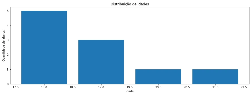
Bar chart. Source: Author.
This type of chart is useful to group elements around a common metric, like a count, a sum or an average. This characteristic makes this chart useful to compare.
- Amount of data classifications: few. Although there is no exact number of categories, I have as a reference the default number of bars to be shown on Google Data Studio, which is 10;
- Type of data (discrete or continuous): discrete;
- Relationship between data: not related.
Line chart
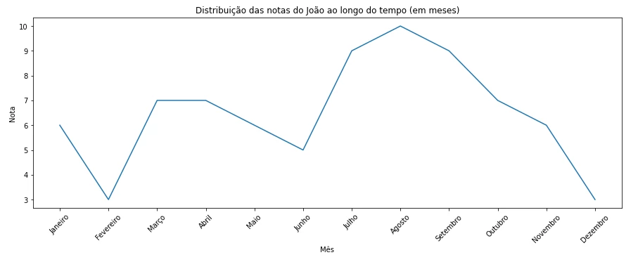
Line chart. Source: Author.
The line chart is useful to identify trends, and it is a good choice when it is important to understand the fluctuations between a dot in the chart compared to the other ones.
- Amount of data classifications: few;
- Type of data (discrete or continuous): continuous;
- Relationship between data: related.
Pizza chart
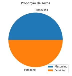
Pizza chart. Source: Author.
The pizza chart have a particular use: observe the parts of a whole. This chart is useful to understand the classification of data when there are just a few categories.
- Amount of data classifications: very few. There is no right number to be considered as limit for this type of chart, but I usually go with 2 slices;
- Type of data (discrete or continuous): discrete;
- Relationship between data: not related.
Histogram
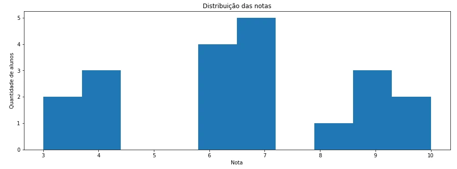
Histogram. Source: Author.
The histogram is similar to the bar chart, but its function is to categorize continuous variables. It is suited for visualizing data distributions. This chart is useful to understand how a data set is spread, or distributed. The data is categorized in intervals, or bins, and the quantity of bins is determined when constructing the chart. A word of caution when using this chart: a biased choice of bins, or binning bias. Visualizing the chart with too few or too many bins may not yield a representative distribution, and valuable information can be lost. It is a good idea to create this chart a couple of times, with different quantities of bins, to know the best amount of bins that represent the data.
- Amount of data classifications: one;
- Type of data (discrete or continuous): continuous;
- Relationship between data: not related.
Scatter plot
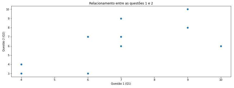
Scatter plot. Source: Author.
This chart is used to visualize the relationship between two continuous data sets. It is useful to visually understand how two variables move together. The scatter plot is able to accept a third dimension by using resources such as colors, forms, opacity or element size to distinguish categories inside each dot. Using the tables previously presented in this post, we can build a scatter plot from people that answered questions 1 and 2, arranged on axis X and Y (first and second dimensions). By dividing respondents by sex and assigning one color for each sex, for instance, dots will be rendered on the screen according to each sex, and this is the third dimension (color).
- Amount of data classifications: one;
- Type of data (discrete or continuous): continuous;
- Relationship between data: not related.
Box plot
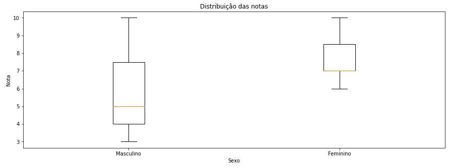
Box plot. Source: Author.
Just like the histogram, this chart also allows to visualize the distribution of sets of data, but it shows more information about the distribution and allows to categorize the data set. If using a histogram I can show the distribution of respondent’s ages for people that answered each question in the previous tables, for instance, using a box plot I can represent this same distribution divided by sex.
The area of the box represents the biggest volume of data, the place at which most data is concentrated. The line inside the box is the distribution median. The lines, or whiskers, that extend the box are sets of data that are farther from the median. The interval between the end of each line and the borders of the box, and the interval between the borders of the box and the median are called quartiles, and each quartile have a fixed size. The first quartile (Q1), which spread from the end of the left line (where the smallest numbers on the distribution are) to the beginning of the left border of the box, concentrate 25% of all data. The interval between the borders of the box is the second quartile (Q2), which concentrates 50% of data. The median separates the box in two halfes, and each half represents 25% of data. Finally, the interval between the right border of the box and the end of the right line, which are the biggest numbers of the distribution, or the third quartile (Q3), concentrate the last 25% of data. The area of the box between the first and third quartiles is called interquartile range (IQR).
This chart can also show extreme values, which are values very high or very low in relation to the data set. These data are called outliers and appear as dots beyond the lines. The definition of which dots surpass the left line follow the formula Q1 - 1.5 * IQR and for the right line is Q3 + 1.5 * IQR. Any data points that are less than or greater than the number calculated in these formulas will be presented as extreme data points.
- Amount of data classifications: few;
- Type of data (discrete or continuous): continuous;
- Relationship between data: not related.
Area chart
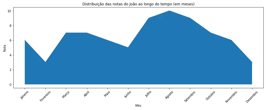
Area chart. Source: Author.
This chart show the distribution of a data set, just like the histogram and the box plot. While the histogram is useful to categorize continuous sets of data, area charts are useful to visualize fluctuations on the distribution of data without the binning bias. This chart is used to visually present the magnitude of changes in the data set, represented by the area below the curve.
- Amount of data classifications: few;
- Type of data (discrete or continuous): continuous;
- Relationship between data: not related.
Heat map
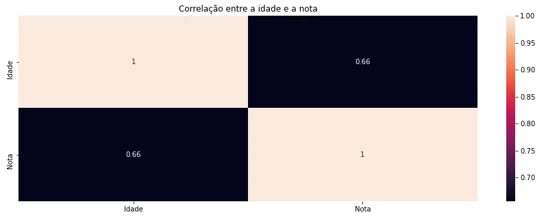
Heat map. Source: Author.
This chart is the union between two histograms: one in the X axis and the other on the Y axis, forming a table with cells of equal size. This chart is used to show correlation between many variables using a color system. This chart is useful to visualize, in a single image, many correlations at once, without the need to create many scatter plots individually for each pair of variables. This chart doesn’t show the shared movement between variables, instead, it shows the strength of the correlation using the chosen correlation metric.
- Amount of data classifications: a lot;
- Type of data (discrete or continuous): continuous;
- Relationship between data: not related.
Chart composition
In 2014, researcher Tamara Munzner published a book called Visualization Analysis and Design, which states that certain visual elements are better suited than others to communicate messages. The researcher was able to classify these elements in order based on the effectiveness of each element to convey information. Elements that are more effective to transmit ordered information are:
- Position;
- Width;
- Angle;
- Area;
- Depth;
- Lightning;
- Saturation;
- Curvature;
- Volume.
And to transmit categorical information:
- Spatial position;
- Color;
- Movement;
- Shape.
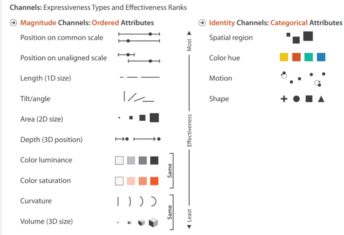
Classification of shapes and colors in a scale of effectiveness to communicate information. Source: University of Iowa.
Consider using these elements of effectiveness as part of the criteria when choosing the chart to be used.
Choosing the best chart
These are just some chart types, but there are many others like the waterfall chart or polar chart. The charts presented in this post should support daily operational necessities of a company. Choosing between one and another will depend on the characteristics of the data and the audience that will receive the message, and one chart may not be enough to tell the entire story.
To see how I created these charts, access this notebook, created on Jupyter Lab and hosted on my Github.
Let’s visualize data!
